5 Ways Lululemon Could Be Better (also, why Athleta is great)
This morning I visited the Flatiron (Manhattan) locations of both Athleta and Lululemon. Athleta, a personal favorite of mine, employs several tactics Lululemon might consider.
1. Use people and music to convey the inspirational "sweat life" that's promoted on lululemon.com. Athleta has an upbeat greeter moving (this is key) around the front of the store, making visitors feel welcome. Lululemon has a stiffer greeter (better than nothing) looking visitors up and down. Athleta has a pop soundtrack and Lululemon plays louder, heavier music.
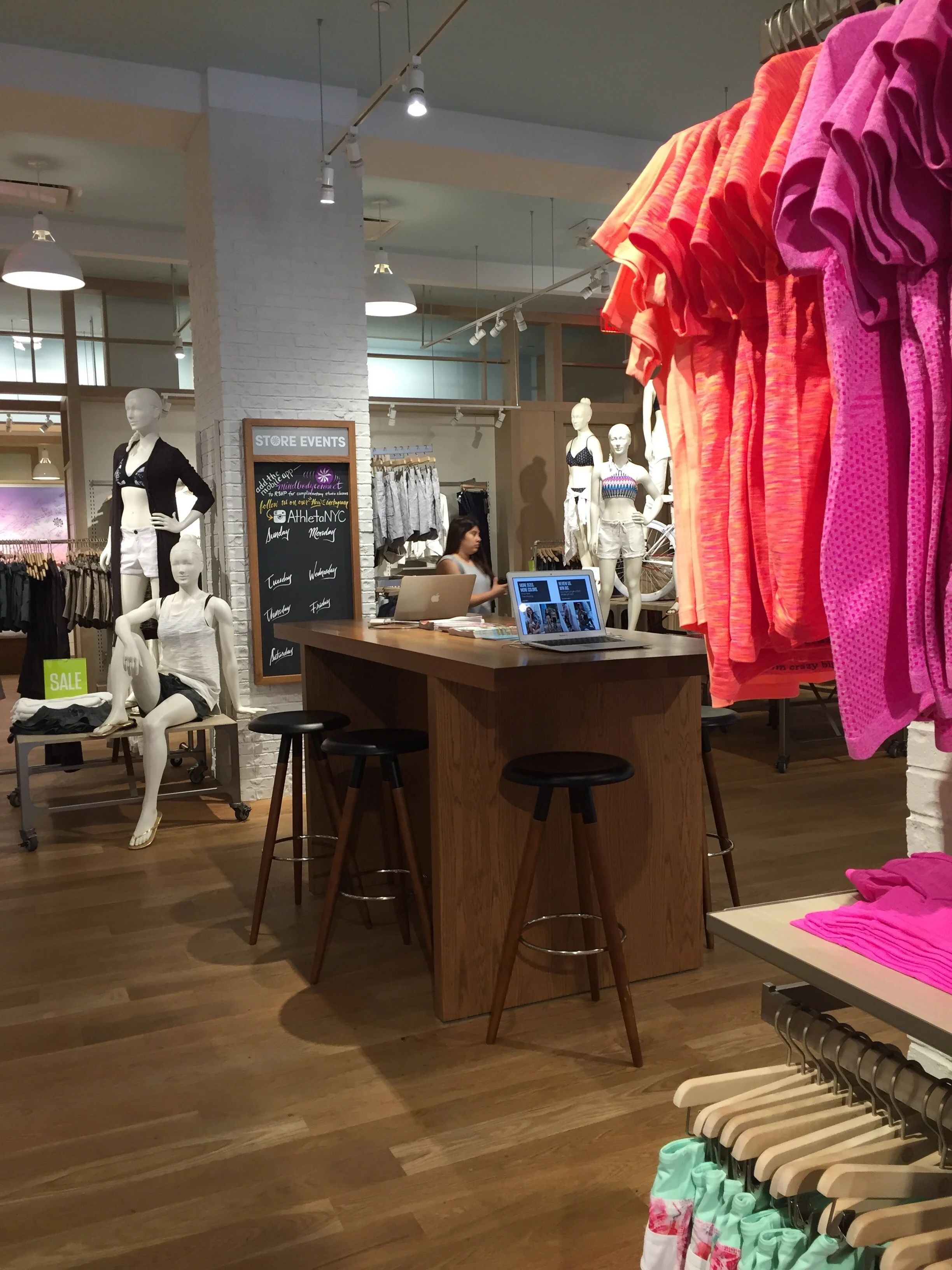
2. Leverage technology where it fits into the story. Lululemon has a shiny, untouchable-looking screen. I think it was some kind of community hub but it didn't exude warmth. And it's only visible once one turns around to exit the store, so while it may have been touchable, I didn't experience it. By contrast, Athleta has a long table with seating where one can flip through catalogs, charge a device and use MacBooks to explore Athleta's large selection of online-only product. This is easy to do self-served or with help (and Athleta always seems to have many, many associates working). It's all very natural.
Athleta's tech-lite table
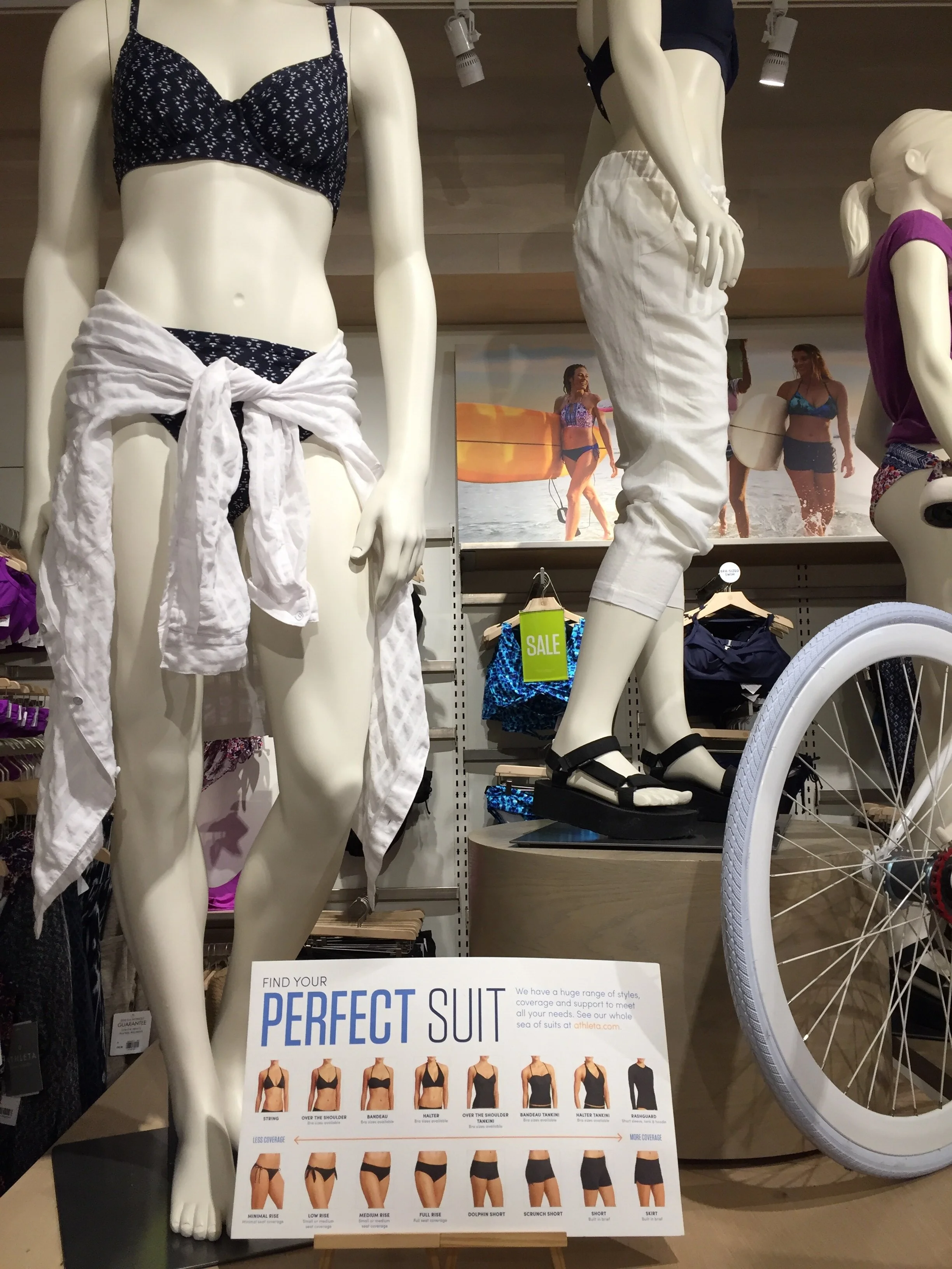
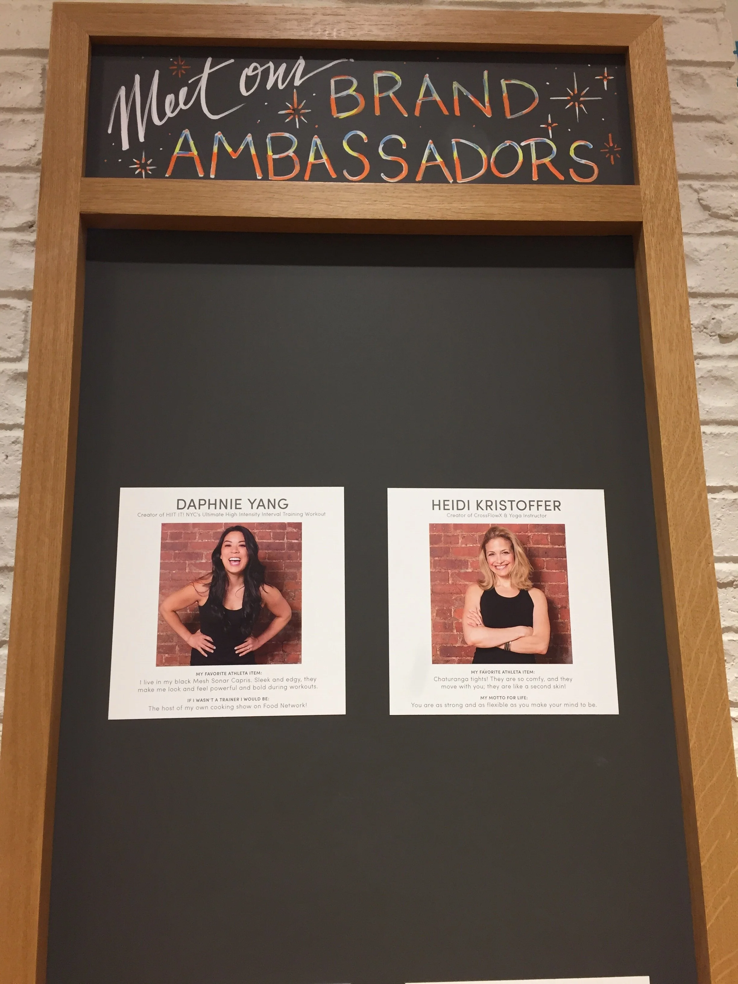
3. Decide where the human touch matters and where it makes sense to be more corporate. Lululemon has handwritten chalk signs to indicate sports bra and pant style names. These don't allow room for information about the styles and they're the only crafty element in a darker, more concrete store so they seem unnecessary. As mentioned above, Lululemom's digital screen references "community", as does a metal tray of business cards on a stark table. Athleta uses helpful, more corporate signage to explain product fit; they switch to chalkboards to convey the personality of local brand ambassadors and update fitness class schedules. (Yes, free fitness classes are offered in a studio in the Athleta store.)
Swimsuit product information on clear signage at Athleta
Fun and flexible Athleta display
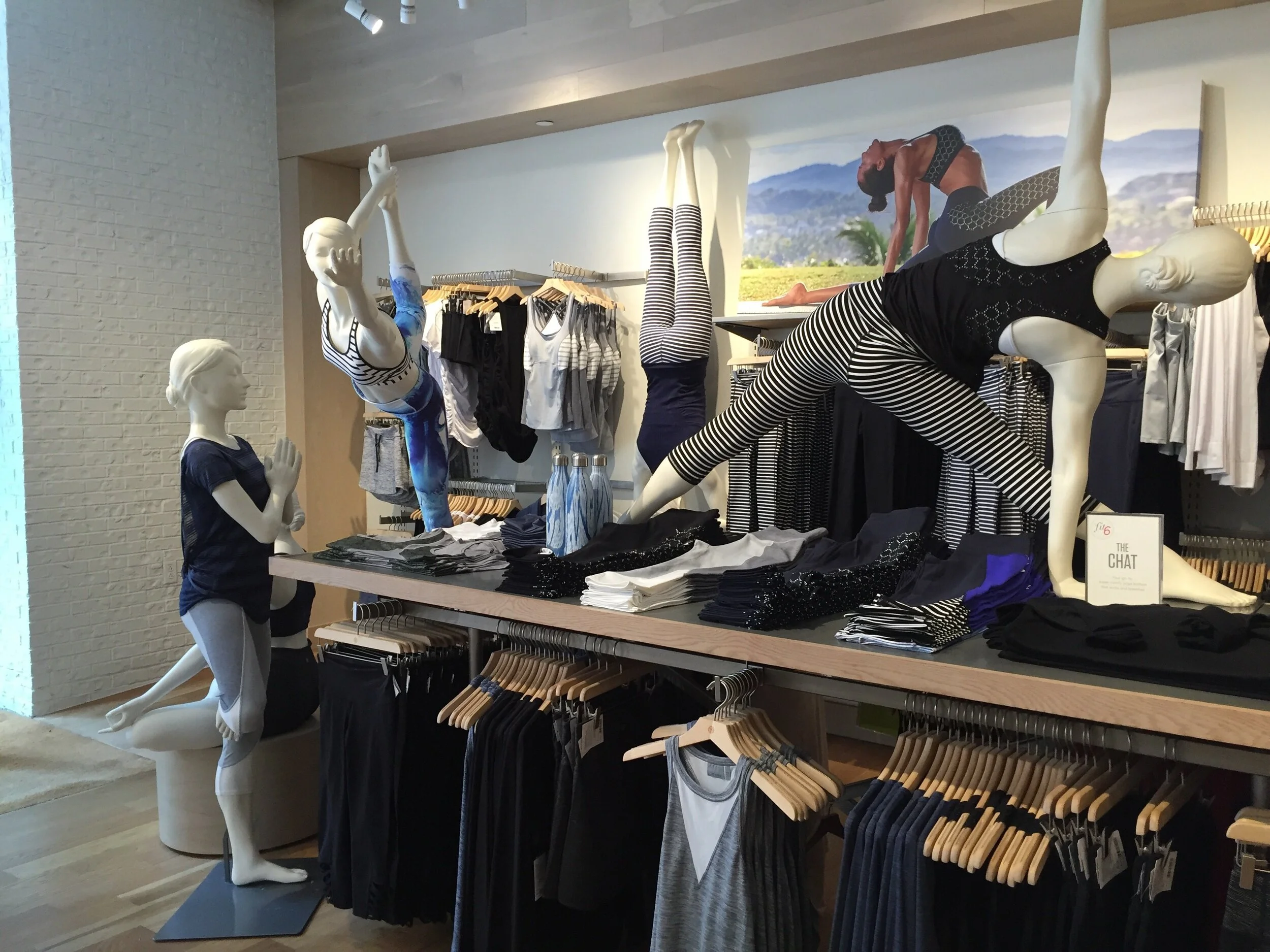
4. Put the largest visual displays to work. Lululemon deserves credit for putting so much product on partial-body forms, which is better than relying on flat or hanging displays. But they're the same forms that could be in any store. In total contrast, Athleta's mannequins are unique to an athletic store. They're eye-catching, full-body and show what the apparel looks like when stretched.
Athleta's well-dressed, well-posed mannequins
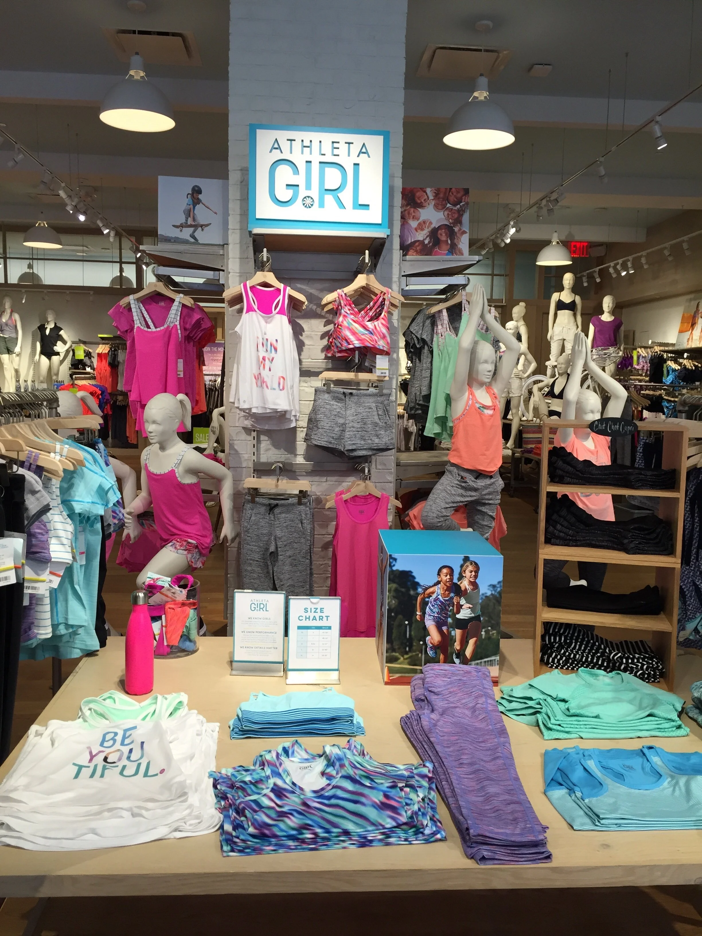
5. If you have space, show off an adjacent product line. Athleta recently made room for a dense girls collection front and center. What a great way to introduce product for the younger set to women who are already brand fans. It's also just an "aww"-inducing store centerpiece that speaks to the depth of Athleta has a brand. Lululemon has men's and women's in its nearby store; its girls brand, ivivva, is a few blocks away. Why not at least tease the younger brand in the parent location? As an aside, ivivva's store feels large for the amount of product it houses, even with the (well-done) coloring table and trampolines in back.
Athleta Girl
